Skoops' Amateur Art Station (Now with 300% more shameless plugging)
-
This board needs more action. And so do I. I had an art topic on the last iteration of the forum, and posted fairly regularly for a while, but around 2015 I more less went dormant as an artist. Lots of stuff has happened, but very recently I had my creative flame reignited with the help of a couple of artists I reached out to at the beginning of the month, so I'll try and post here in addition to my actual art-posting accounts.
I've got a short priority list I'm working through at the moment, so for now, I'll just post some highlights from my gallery here. Before anyone asks, yes, I use a mouse for any and all digital work because I'm too cheap to invest in a digitizer or tablet. At least at the moment. SOME people (YOU KNOW WHO YOU ARE) keep telling me to just go and cave and it's been long enough and I've been hearing this from enough different people at this point that I may go ahead and just do it sometime later this year. We'll see.
Anyways here's my catalogue of inconsistent, questionable, and/or ripe for improvement pieces, starting from oldest to the newest in descending order because I want to get the most embarrassing pieces out of the way first.
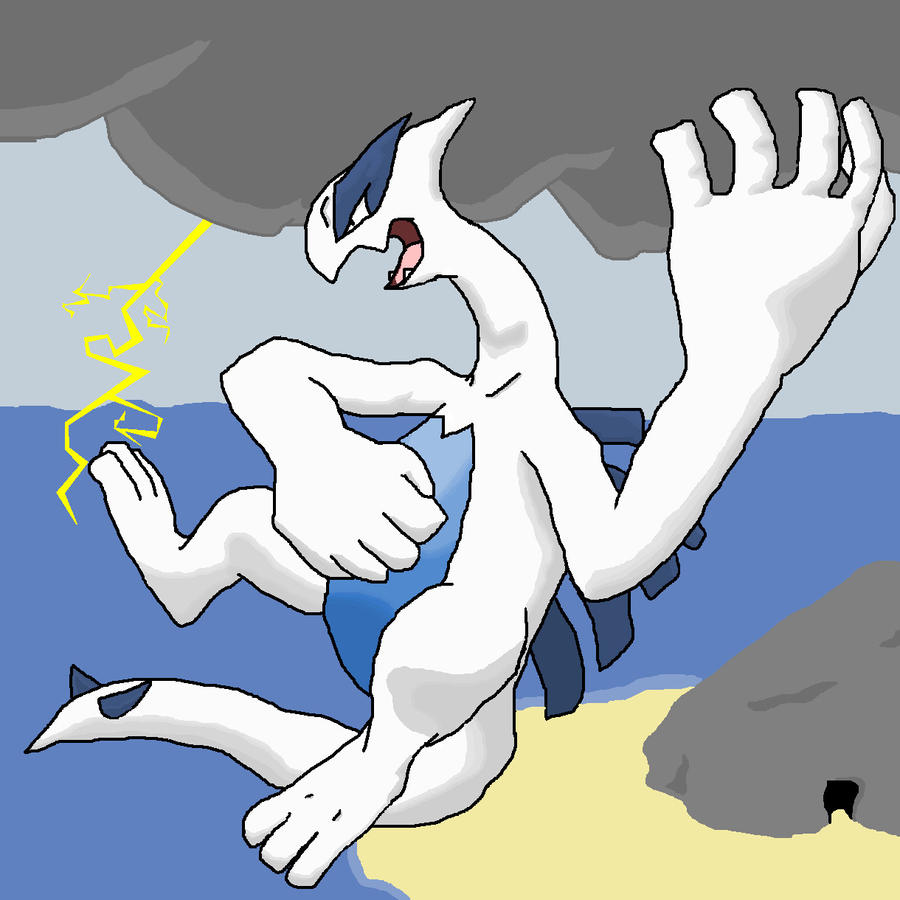
One of my oldest posted works, from September 2010. Done in MS Paint because wow I apparently hated myself. Why yes, the background was in fact a total afterthought, thank you for noticing.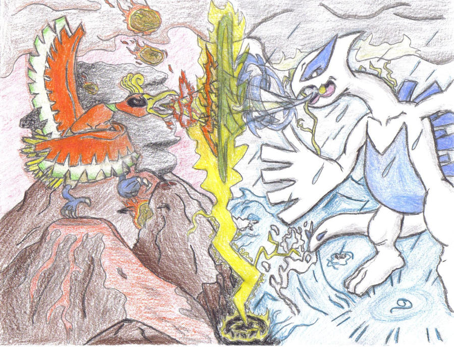
From October 2010. I think this was the last time I colored something with traditional, physical media (For myself, at least) because I generally don't like using them. Was a fun project at the time, though!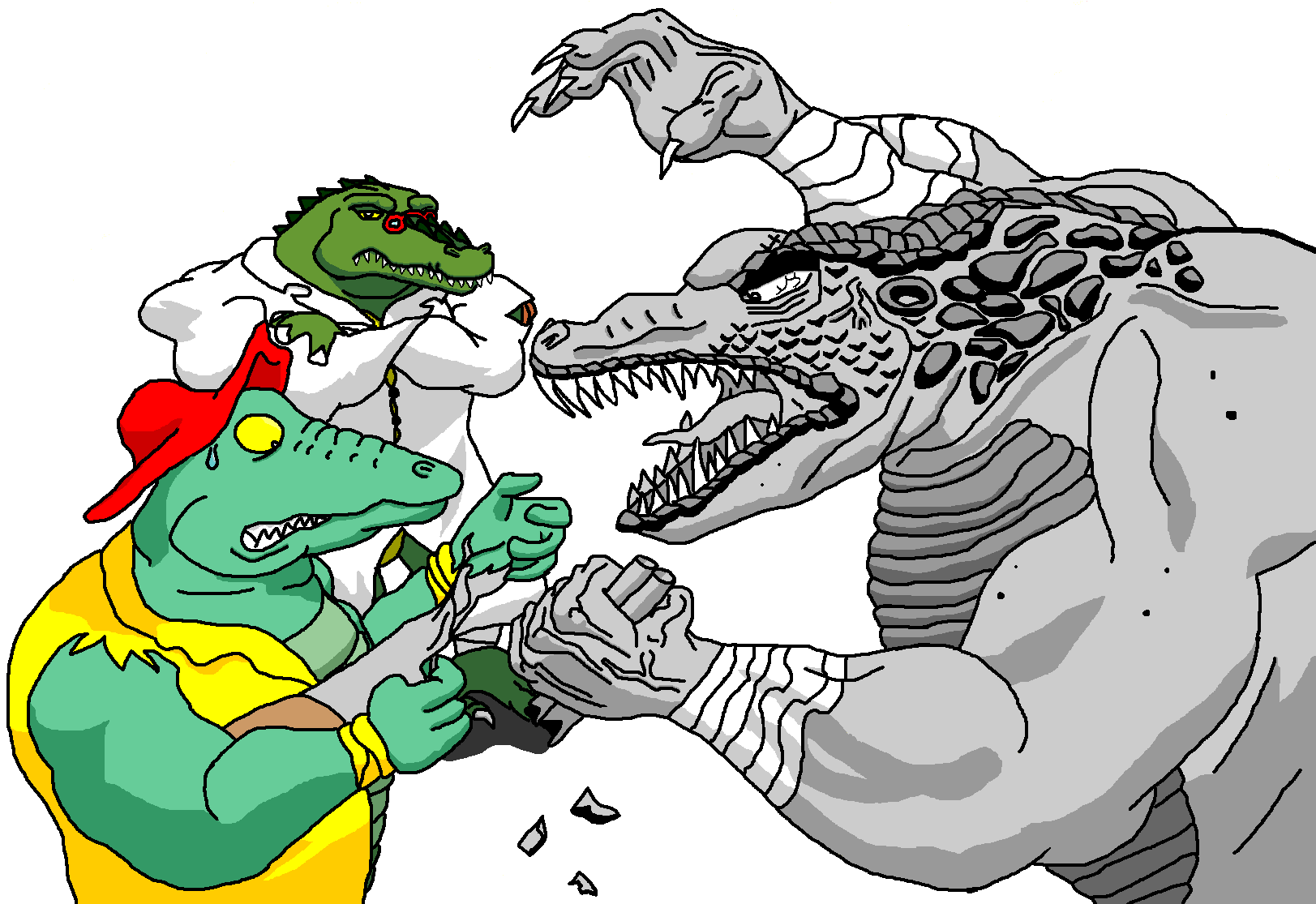
From December 2010, and the last thing I made in MS Paint. (Thank goodness) Was a huge Leatherhead fan back then, (In case the dA username didn't already make that abundantly clear) so I drew him a whole lot. This one in particular was inspired by Turtles Forever, the sort of crossover TMNT TV movie that was supposed to cap off the 2003 4Kids series. (Though I personally felt it didn't need to be canon and the actual ending episode felt more like an ending than this film, but that's a discussion for another day) In particular I was bummed that Leatherhead didn't have even a brief mention or cameo, given that the film seemed to enjoy comparing and contrasting how vastly different the 3 major incarnations (at the time) of the casts were, and Leatherhead has been drastically different from series to series. So I made my own little what-if scenario and it turned out to not actually be that interesting.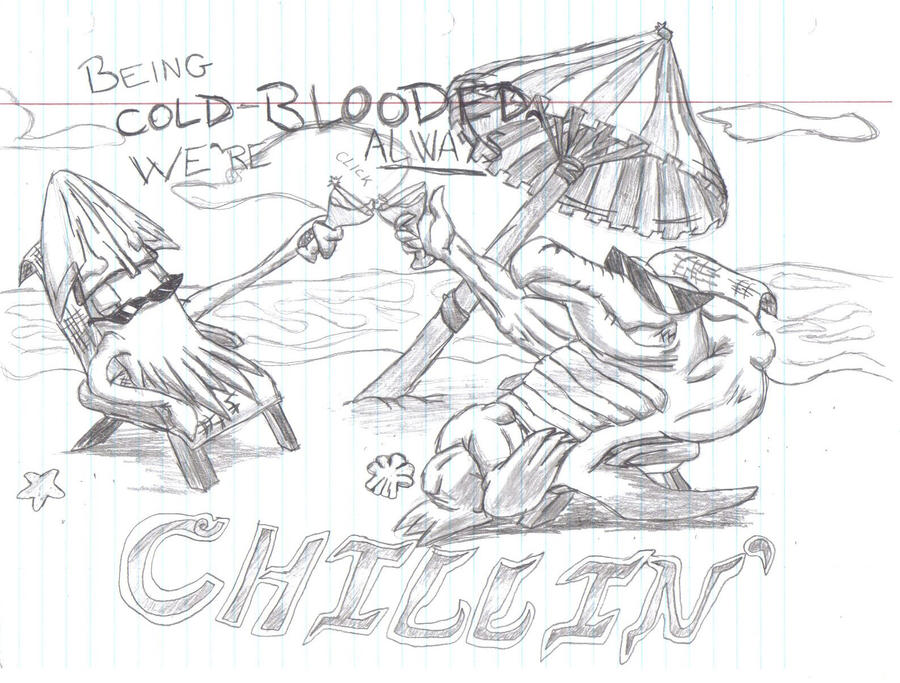
From January 2011. Despite how old this one is, I'm still rather fond of it. I'll have to try and do it over one of these days with the advances I've made in those 9 years.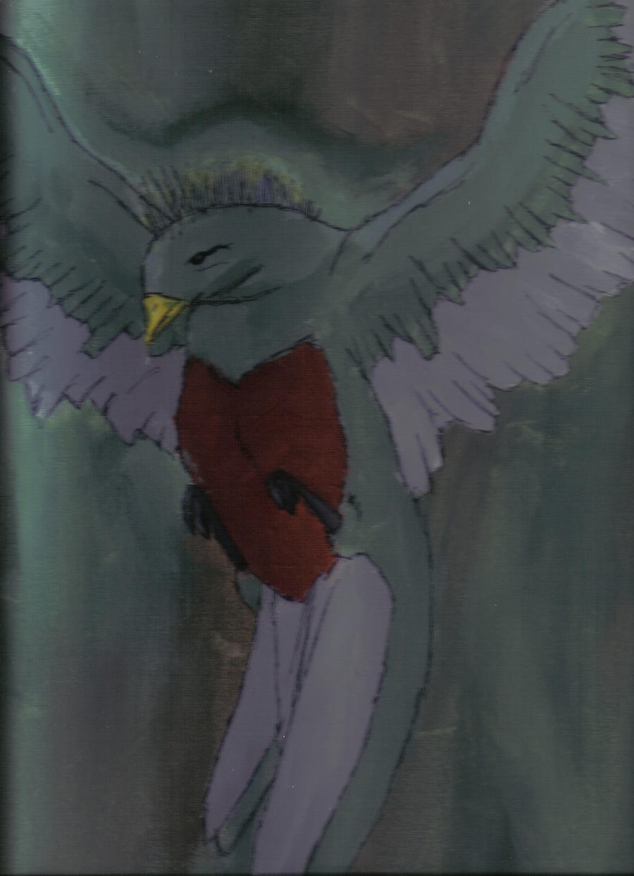
From February 2011, for a Spanish class in high school. Photo isn't great quality, but this was painted on a physical canvas, so scanning wasn't an option. Just a quetzal bird, and I still have this painting hanging up in my room. (As a fun fact, I got like 10 points docked from my grade because I used a sharpie pen to outline the features. Apparently I was only allowed to use paint and nothing else. Whoops.)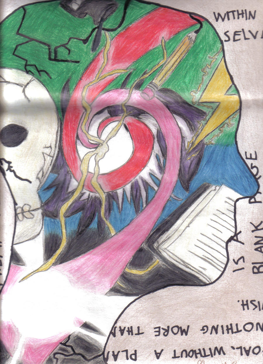
From March 2011. This was a project in my Drawing and Painting class in my sophomore year of high school where our classmates had to trace our shadow onto a paper in profile for us to fill with various things that interested us. I think I got bored of that halfway through and just started filling it with whatever seemed flashy and cool to me at the time, but eh.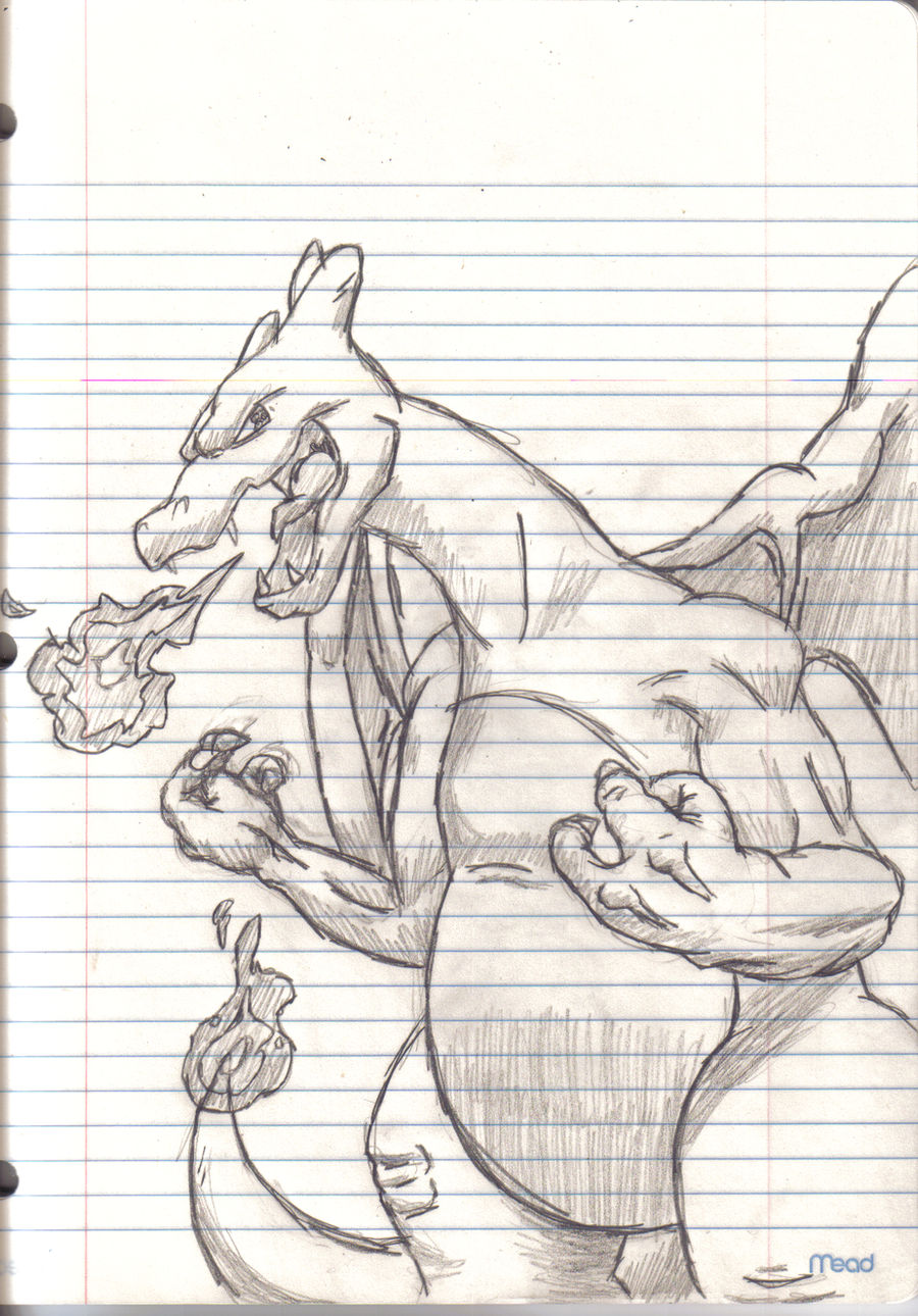
From March 2012. I swear I don't draw this much Pokémon fanart normally, but I was happy with this at the time.
From May 2012. Was pretty big on Black Kyurem's design and wanted to draw it. Tossed in really bad lightning bolts to add some light source practice.
Also from May 2012. Props to VG for helping me with this one, if he even remembers. This was my first time using layers, and I didn't really understand how they worked, so I sought his help with organizing my layers and exporting the xcf. Also I love Zekrom. Tried to experiment with a different shading style. Didn't really work, but that's why we experiment!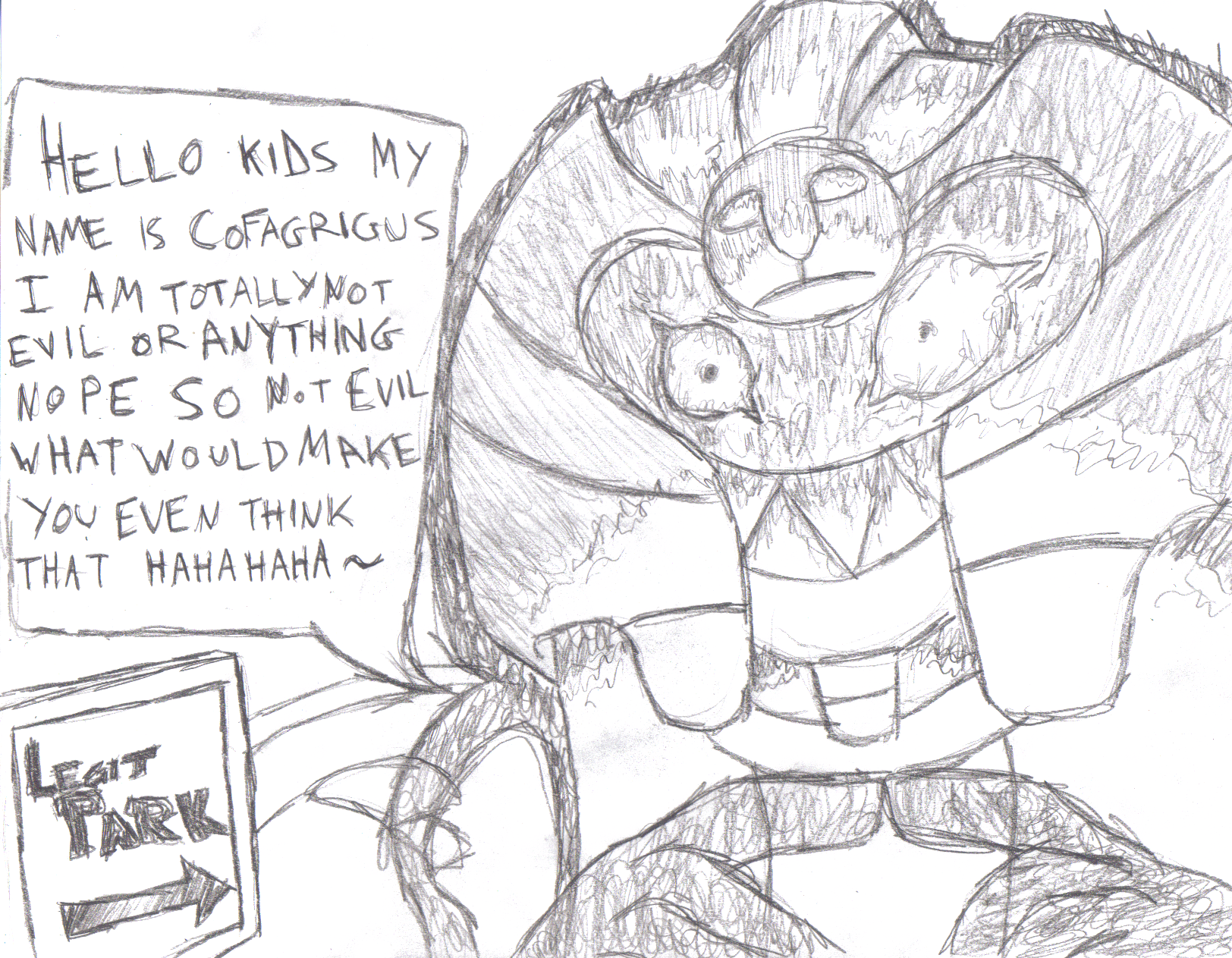
From June 2012. Fanart of sorts for the HellfireComms livestream of PokéPark 2. Also yes I am aware that I said I don't do Pokémon fanart that much like 3 images ago and then immediately followed up with nothing but Pokémon fanart. What's your point.
From August 2012. Just a minotaur I eventually named and turned into a character, Boaz Michael Mac. Used him once in one of the RPGs here back when we had the RPG board, but otherwise...not really done a ton with him.
From September 2012. Was fiddling with water and reflective lighting mostly.
From January 2013. Was a sort of spiritual remake of my very first dA submission. A significant improvement at the time, but I'm not really happy with it these days. Wonky anatomy, kinda weird physiology, and man those background colors could use some more contrast with the subject. Shadows are rather sloppy, too.
From March 2013. Not really good at cutesy stuff, but wanted to try it anyway. Remember to hug your local Typhlosion.
From April 2013. Just my dragon Lex looking silly for my ID on dA back then. I like to toy with expressions, so this was a fun one.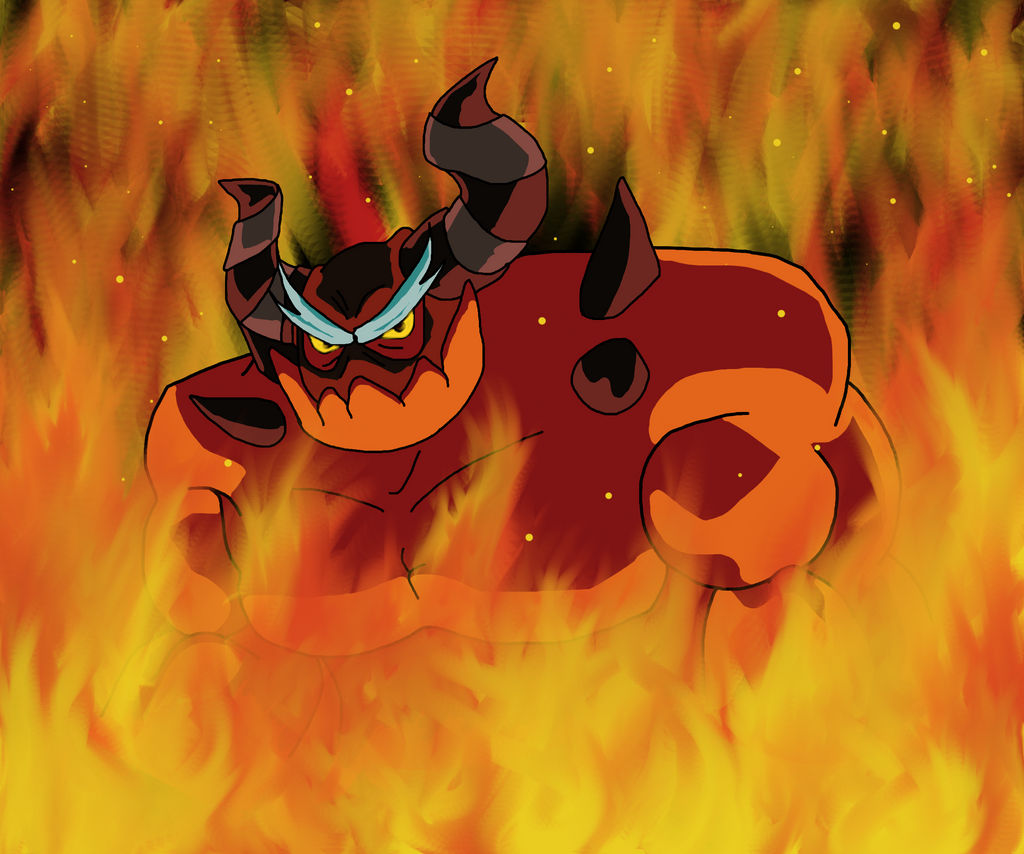
From June 2013. Fanart for Sonic Lost World, which wasn't out yet at the time. I forgot about Zavok's little ponytail thing he's rocking, but honestly I like him better with out it. Rough work on the flames in the background because I think I started rushing by that point, having had been working on this piece for about 4 long hours. (If only I knew just how many consecutive days I'd spend on a single piece in 7 more years)
From July 2013. Fanart for Polar Bear Cafe, a very cozy anime that I like to recommend whenever I get the chance. Grizzly is the best character. Fight me.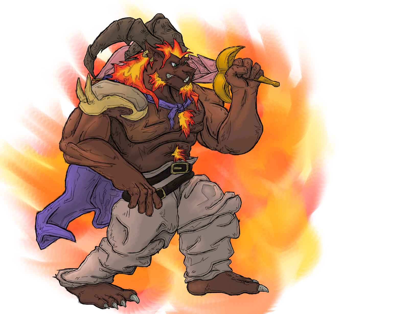
From August 2013. Once upon a time, I had an idea for my own Final Fantasy game, where the whole cast was made up of the series' staple summons. This was my concept art for Ifrit, based mostly on his appearance in FFVIII. I spent far more time on this piece than it probably looks. (If you know the phrase "petting zoo" in regards to art, then you know what I mean) I think it was about 3 weeks. And I know I could do this far better now so I'm not exactly proud of that.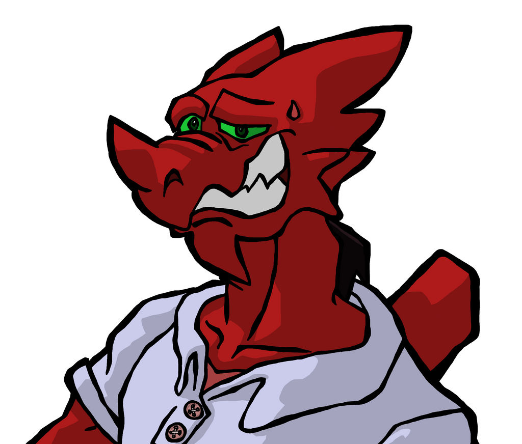
From July 2014. More silly expressions with Lex. From here, you'll notice bigger and bigger skips in time as I slowed down considerably in my work output.
From December 2014. This...was a ton of fun to make. Spent about 4 hours on this one, and my back was killing me by the end, but this was a blast just experimenting with the shading. All done in gimp, no filters or anything, Each value here was its own brush strokes on its own layer, and while it took forever, it was incredibly satisfying to watch it come together. I originally planned to make more of these for the rest of my Omega Ruby party, but never did because I'm fickle. Wish I had thought to use a better-suited tool for the bubbles, and the background's not really anything I'm proud of, either.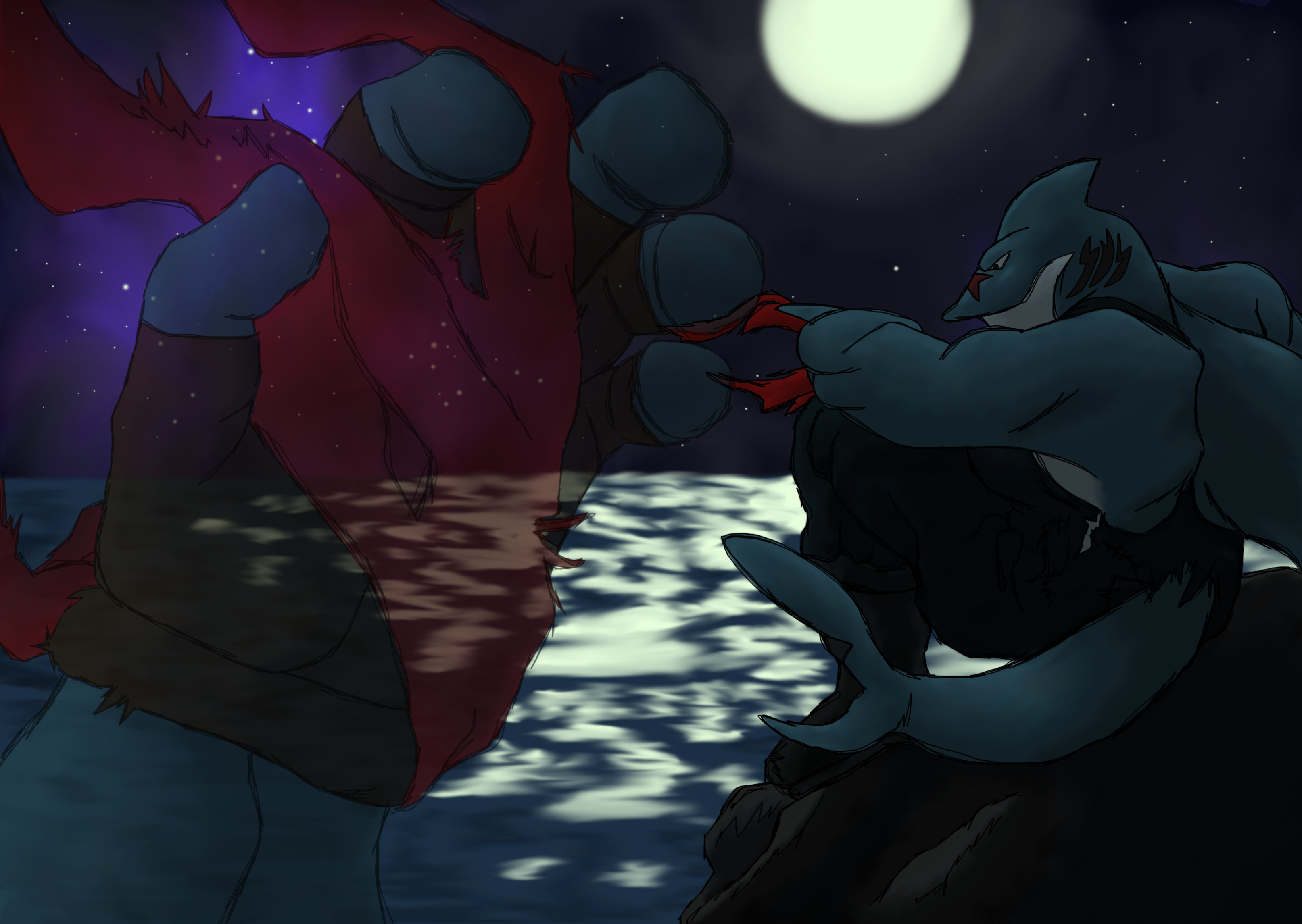
From June 2015. This was probably the last piece I made with any sort of real passion and motivation in it. This shark is Ajax Anchor, a character I'd drawn plenty before, but this was the first time I drew him with a story and characterization in mind. Started writing a proper story at the time, but have since rewritten it, lost it, and then not bothered to try writing it again. But maybe someday.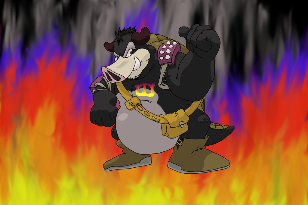
From January 2016. Here's my original character please refrain from thieving. Anyway, this is Ivan, a boarmadillo character I made for another RPG here on LLF at the time because I saw an RP and was like, "Ohhh, this scenario sounds cool, but ugh, Mario-verse, bluh..." And then I made this fella. I'm not actually proud of this piece or the design, but I am rather happy with the history I made up for Midbus' race in the process because lord knows we'll never get any lore on him officially. Here's a link to the original page if you want to give the bio a read. As a fun fact, this piece wasn't even supposed to exist at all. I only sketched out a rough design so I could fill-tool color it in and figure out what colors he'd have. But, for anyone who's ever used gimp and tried to fill-tool a hand-drawn sketch, you know why that's a terrible idea. So then I inked it to make fill-tooling more effective. But then I thought, "This would be so much easier to picture if it was shaded, too..." and things just kinda kept escalating until eventually I had this whole...thing. Oops.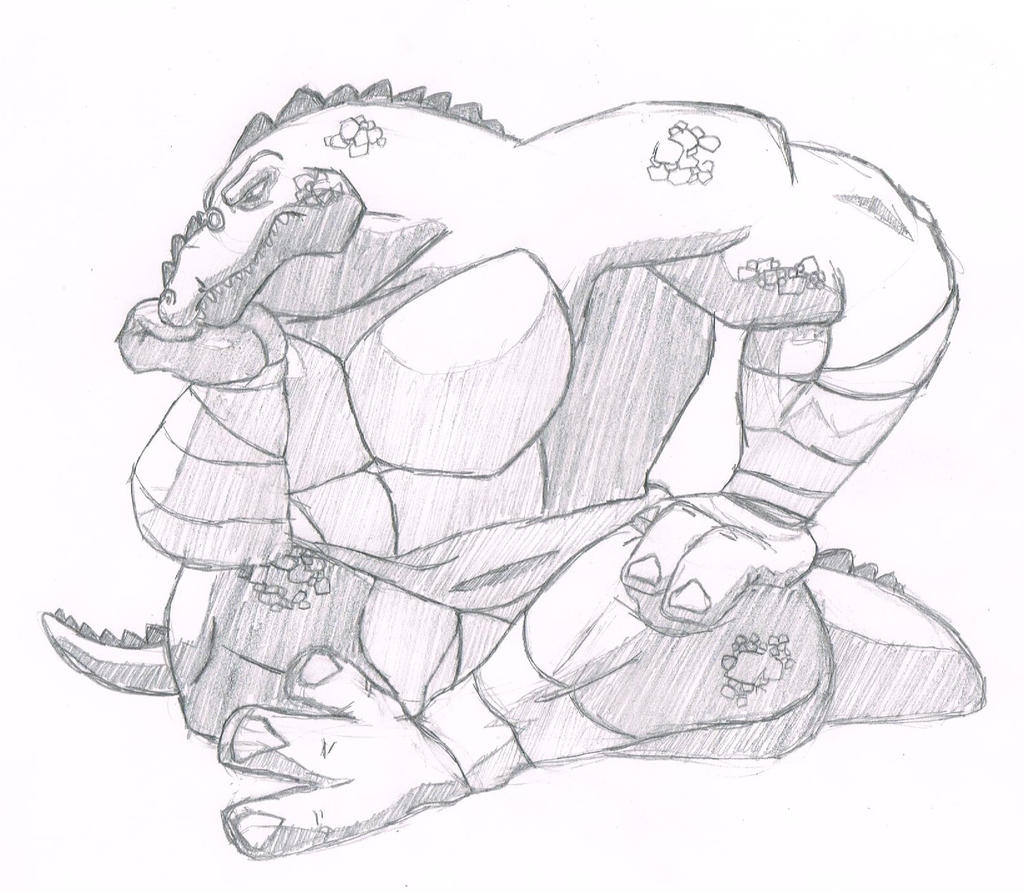
From June 2016. More Leatherhead. A little pose study and a slightly different shading technique.
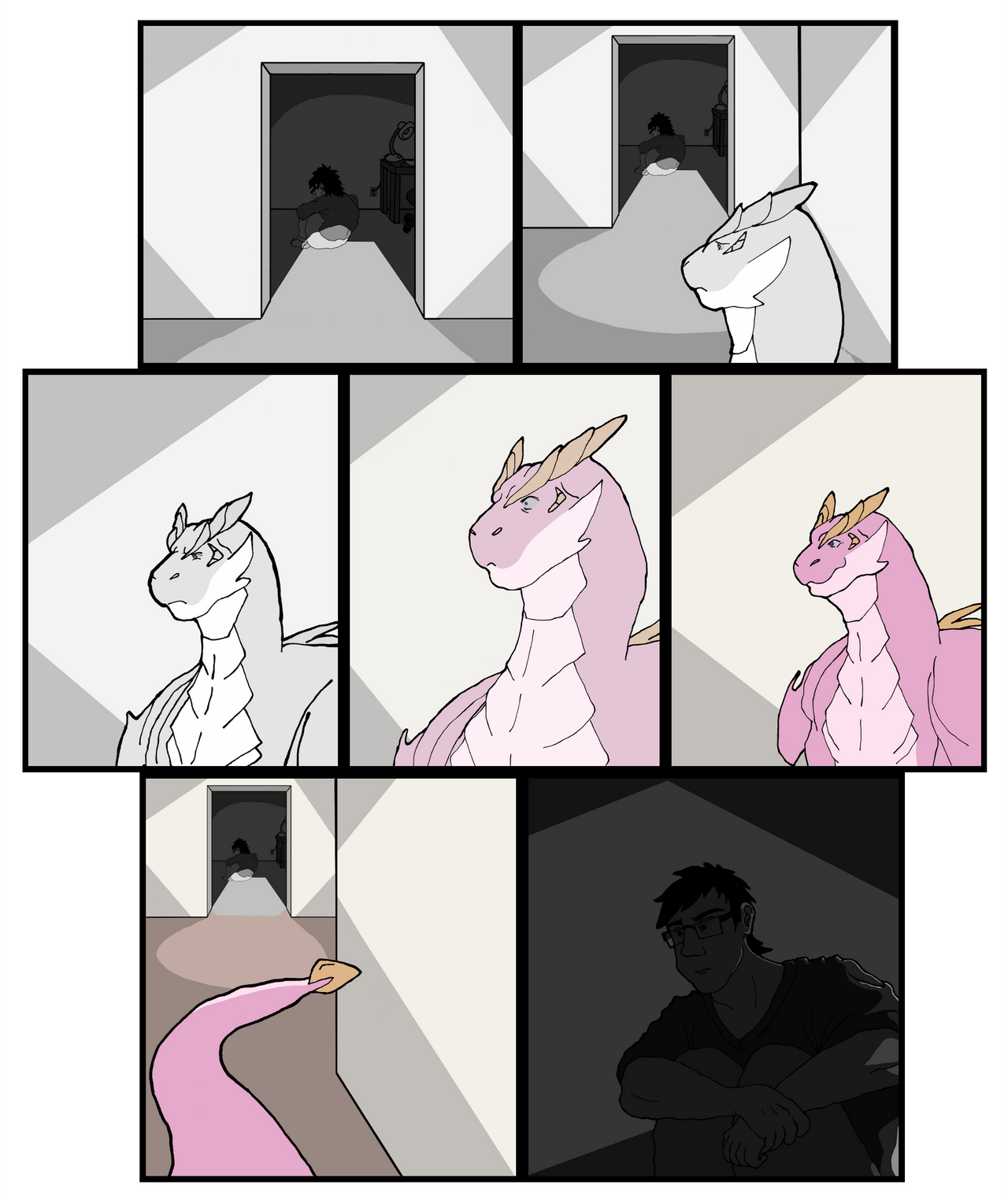
From October 2016. I fell in love with Incineroar the moment he dropped. Also just having fun with expressions again. But he's the best Alola starter and I will hear no contradictory opinions get out of my server.And so, finally we come to the stuff I've made this month. In 2020. I DID make a few things in 2017 and 2018, and kinda in 2019, but nothing worth sharing. Anyways, for context, I reached out to an artist whom I'd admired for a while, and he's had a really rough time lately to put it lightly. But he was so friendly and nice, and the conversation we had really inspired me. He mentioned how he used what little time of peace he had to craft art for others and bring them joy, and I realized that maybe I could do that, too. This led me to consult a close friend of his, whom was another artist I've admired for a long time, and ask for his help in finding references and forming an idea of what I could make to thank my new downhearted friend. Ultimately, I crafted this short comic. The human is the artist I made this for, the pink dragon being his emotional support dragon he draws often, and the brown dragon being the fursona of the other artist I consulted for help in making this. Special thanks to Ghost here on LLF for installing the flats, saturation layers, and being a huge help in cropping and lining up all these panels and organizing them into tidy pages. (Each panel was drawn on individual sheets of paper and inked as full images by themselves, so the original docs were HUGE) This took 2 straight weeks of work, and I hadn't felt so happy working on a project like this in at least half a decade.

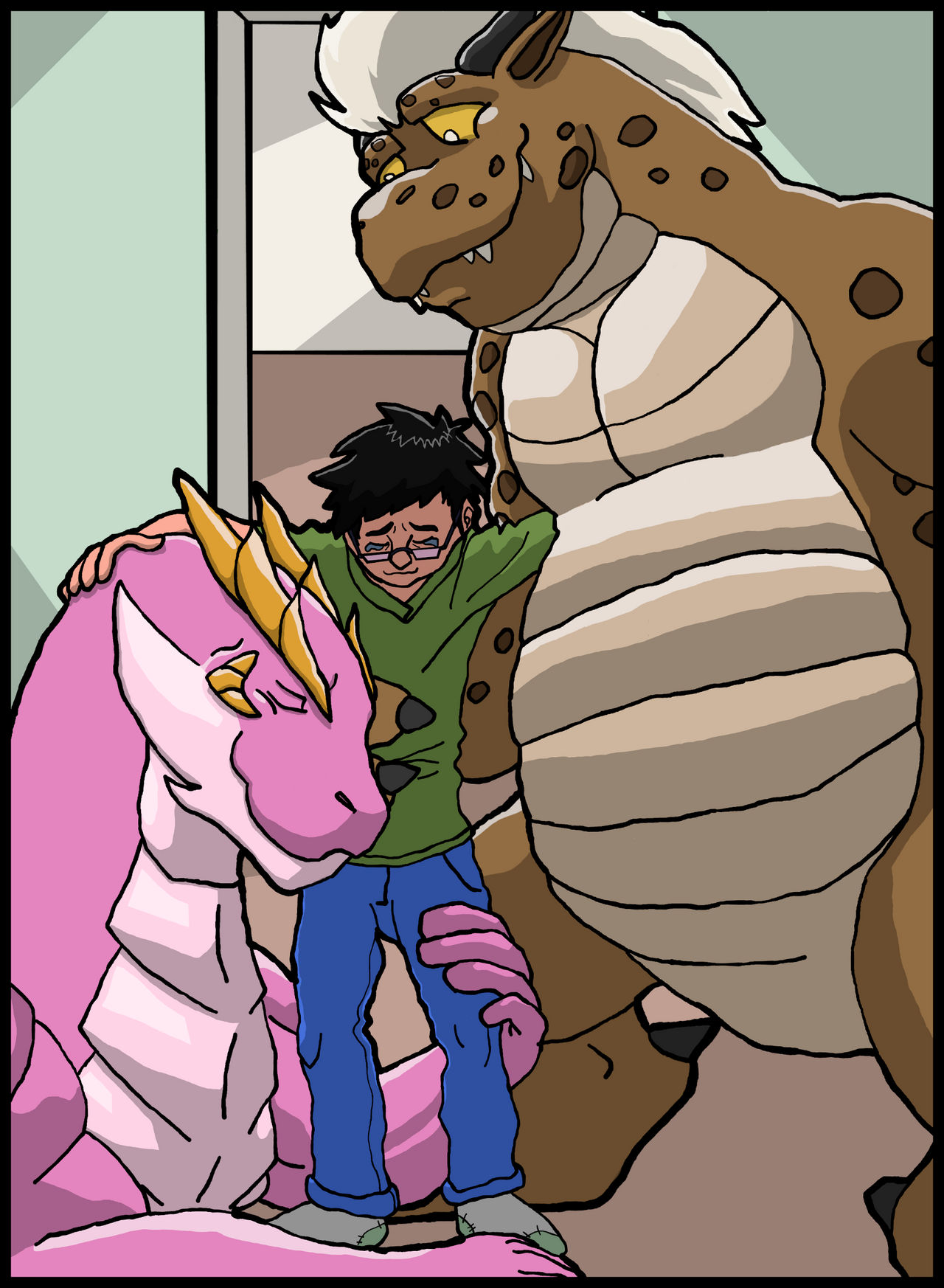
It's sappy, I know, but I felt really good working on this, and the artist's reaction when I sent it to him made it all even more worthwhile. It might not be the most technically impressive thing I've done, but it's easily one of the most personally meaningful.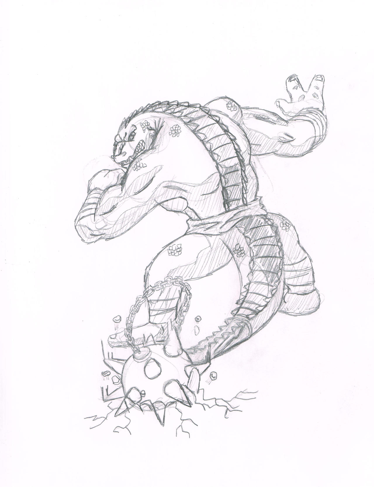
And finally, here's a sketch I made a couple nights ago, as what was SUPPOSED to be a warm-up for my actual drawing session. And then, uh, suddenly it'd been more than an hour and I was still finishing up my final lines. Basically another spiritual remake of my first ever dA submission, though I'd like to think this one's got some better anatomy going on. (Not crazy about the right leg, though) Might ink it in commemoration of my 10 years on dA this September, but we'll see.Anyways, thanks for humoring Mr. Skoops' Self-Indulgence Express. Please disembark at the nearest X in the corner of your browser. I hope to be posting here more regularly, as I'm trying to work on art every single day. Feel free to check out my full gallery and give me some feedback on what you like, what could stand to be improved, suggestions, tips, death threats, hate mail, whatever you like. Just don't make it weird. I'm weird enough already.
Laters!
-

Drew Boaz again for the first time in...a long time, apparently. (7 years since the last time I submitted a work including him, at the very least) Spent a while last night doing practice sketches for an art trade, and decided to use the remaining 15 minutes to draw something for myself....And then when I looked it again this afternoon I hated it and just kept reworking everything until, 3 hours later, I ended up with something that at least doesn't actively bug me. Much. Slightly altered his design, gave him ears, simplified the design of his necklace, and finally gave a sense of scale, since he's a mighty big fella. The background was originally more like a town square with a fountain, but that just wasn't working out at all since I couldn't form an appropriate object for him to be leaning on, so....Have a nice little neighborhood instead, I guess!
-

Sketched this out last night before bed. Here's Lex, doing my offline work as a customer service clerk (which is just a fancy, almost important sounding way of referring to a bagger) at a grocery chain we have here, called Publix. It's known for its customer carryout service, and some of my friends have been amused by the idea of this, given that Lex is only 12 inches tall. (Although I think I may have gotten the scaling wrong here because I felt awful yesterday and should have gone to bed already)...I am starting to wonder at this point if Lex technically qualifies as more of a kobold than a dragon, though. Oi.
-

I've had Lex for almost 9 years, and never actually codified his design with a reference sheet, so I did this today. Nothing exciting, but it's something I've been meaning to do for years, so it feels good to finally have it done.
-
-
Thanks, Kaiveran! Normal, non-degenerates are welcome to post still. We don't have to corrupt VG's hard work.
More than it already is, anyway.Drew lots of stuff today! Mostly practice sketches for characters of other people, so I won't post those, but I did draw my favorite shark, Ajax!

It'd been about 2 years since I had drawn him last, so here he is! First time I've drawn his teeth...almost ever, think. (There was a short comic I drew a long time ago that was awful where he had gritted teeth, but I won't count that)

And then I drew him to scale! Like Boaz, he's huge. I wanted to experiment with space management, but also wanted to redesign the big guy. Unfortunately I feel both things ended up compromised. I'll have to try and limit myself to 1 ambition per sketch in the future. Decided to change his design to make more sense with his lore. As stylish as those fingerless gloves and rubber boots were, they had to go. Added more patches on his fishing waders, too, since he has to tailor them himself to fit him....Poor guy still isn't used to human homes, though. Especially those from the 1600s. (He lived during an alternate version of our history, in the Salem witch trials specifically, for anyone curious about the setting he's in)
I'll make references for him and Boaz some day. Just got other more important things I want to draw first.
-

This was kinda spontaneous. Decided to paint this on a whim at the start of my stream today. (Did I mention I do those? I do those. Can find me here.) I also decided to be stupid and try lineless painting with a program I'm still learning whilst also limiting all my colors and shades to a single layer. Because I hate myself apparently. Not really happy with the final product, but it was certainly an interesting time. I'll have to try a similar challenge when I get to know Sketchbook and its various brushes and tools better.
-
-
-

Sketched this out the other day. It's basically an in-joke regarding YTguy's trainer in Sword and Shield. He insists that she's very fashionable, and everyone else disagrees strongly, so somehow this led to me making comparisons to Lightning from Final Fantasy XIII....And now we have Lightning dressed as YT's trainer. Yup. This was a thing.


Not sure why, but I found myself fiddling around with Ifrit's design, while we're on the subject of Final Fantasy. These were a couple rough concept sketches for a redesign of his character in that vague FF fanfic game thing that will never actually come to fruition, Final Fantasy Entities. It's not actually that different, just gave him some bushy eyebrows, removed an earring, added a puffy shirt and vest, and removed a belt because I am not Tetsuya Nomura. Oh and I added claws.
Sketched this earlier tonight for Bowser Day. Every year I miss it and think, "Aw man, I should have made something for that. Oh well, I'll do it next year." Well I did it this year. I uploaded it after midnight, granted, but...hey, 20 minutes late is better than nothing. I pulled the cape from that one bit of artwork from SMB3. I kinda like it, honestly. I'll have to fix and tidy the drawing up later, though. I know I broke like the one rule about line shading here, mostly because I was rushing myself to get this done before midnight. Spent about 45 minutes on it, but it probably should have been a full hour.
-

Last night, was talking to some friends about how I don't particularly care for the Kalos starters. Greninja's cool, but not really one that jumps out at me as something I really feel drawn to. Cue everyone else being surprised that I don't like Chesnaught, since it seems like my type. I don't hate it, but something about its design has always just...not clicked with me. Later I started thinking about what elements of the design I disagree with and what I'd change, and today I decided to go ahead and just draw it out. This is actually the second draft, as the first one was more of me trying to figure out how Chesnaught's anatomical structure worked, as well as sort of tossing stuff at the board to see what elements I liked.Ultimately, though, this is the design I settled on. I swear the similarities in pose between this and Bowser's Smash Bros. 4 artwork are a complete coincidence; I didn't even realize how close it was until after I'd already drawn the shape. Must have been a sub-conscious influence or something. (That WOULD explain why my foreshortening experiment here actually worked...Huh.)
For anyone unable to really tell what I changed, I added ears, turned the spikes on its forearms into spiny bucklers, removed the...shell-like...thing on its back in favor of a grassy cape, removed the spikes from the ends of its clavicles, gave it a defined nose, altered the shape of the spines on its shoulders as well as moving them up onto the tops of said shoulders rather than the back, added hard clips that attach the cape to the, uh...breastplate-like thing over its chest, shortened the tail, and colored in patches of the limbs and torso that were previously all a single color.
Phew. It didn't seem like that big a list when I was actually drawing it.
-


A few character studies I worked on late last night. Been having a less than stellar last few days and wanted to try picking myself up by making something. I actually wanted to try drawing Team Chaotix in general, but realized I haven't drawn any of them in a long time, and when I did, well...they were rather...off-model since I didn't use references.
Maybe I'll get around to making the picture I had in my head originally, but this was a nice practice session, regardless. Sonic anatomy is pretty far removed from my usual thing, so it was nice to force myself to work a bit differently.
-

Sketched this late last night. I'll make a ref for him someday I swear. Eventually. Probably.
Started painting it in a stream this evening. Obviously it's not finished, but I figured it wouldn't hurt to post something in the middle of my process for anyone interested. It's been a really long time since I tried to do heavier rendering, but it's been fun getting back into the swing of it again. Hopefully I'll wrap this one up in the coming days.
-
-

Finished after 2 streams today. My hand has been having some choice words with me, but I had a lot of fun with this for all 7 hours it took. I'm hoping to do more fully-rendered work like this in the future, though probably not super frequently. For my hand's sake. (YES I KNOW I SHOULD GET A TABLET HUSH GHOST)That's about it, otherwise! I'll upload the stream archives in the near future and link the playlist for anyone who cares to watch them, I suppose. They are long, though, and I'm not always talking, I'm afraid.
-

It took 3 days of inking, coloring, rendering, trying to figure out how to make metal, and cleaning up a mess of my pallet, but it's finally done. 10 years ago on September 1, I submitted my first drawing to dA, and I wanted to use everything I've learned in that time to try and reimagine it. (For reference, the original from 10 years ago is here ) I had a lot of fun working on this, and I hope that if I ever lose my creative flame again, I'll reignite it a lot sooner than 5 years passing again.I'll keep giving it everything I've got!
-
Yesterday, a friend of mine prompted me with the question of arranging a PMD-style squad of any combination of 2-4 Pokémon I wanted. I took a good while trying to figure out what on earth I'd want, but eventually I settled on a Sandshrew, a Houndour, a Charizard, and a Druddigon, which each would have had distinct personalities and troubles that their surface level impressions belie. So today I decided to draw them! Might ink them sometime, might not. T'was a fun exercise, though. I need to draw backdrop elements more.

Name: Strew
Species: Sandshrew
Relative Age: Equivalent to early/mid 30s in human age
Gender: Male
Height: 2'1"/63.5cm
Weight: 17lbs/7.7kg
Misc Info: Hardened, gruff, and jaded Sandshrew with a faded hide and many scars and chips on his body. Often looked down upon, ignored, underestimated, and discounted by strangers; hates being treated as lesser, weaker, or otherwise being treated differently just because he's small and unevolved. Very intelligent and has good leadership skills, but also a nasty temper and needs the help of his friends when he loses his cool sometimes. Refuses to evolve out of spite so he may prove his strength, skill, and maturity to those whom cast doubt upon him.
Moves: Slash, Dig, Night Slash, Facade
Name: Fray
Species: Houndour
Relative Age: Equivalent to late teens/early 20s in human age
Gender: Female
Height: 1'9"/53.3cm
Weight: 11.1lbs/5kg
Misc Info: Very affectionate, loyal, and sweet. Respects and admires Strew greatly for fighting so hard in opposition to the shallow judgements of others, supporting him in spite of her own fragile confidence due to her upbringing. Normally very energetic and extroverted, and gets riled up when it comes time to fight or defend others. Suffers from some emotional scars from when she was younger that cause her to be disarmed by certain triggers.
Moves: Return, Beat Up, Flamethrower, Crunch
Name: Charley
Species: Charizard
Relative Age: Equivalent to late 20s in human age
Gender: Male
Height: 5'11"/180.3cm
Weight: 455.4lbs/206.5kg
Misc Info: A very large Charizard who is very, horrifically shy, cowardly, and lacking in all confidence; often has to put up with others turning to him because they expect him to be strong, confident and a natural leader, which only serves to make him feel all the more self-conscious of disappointing others or not living up to their expectations. Incredibly emotionally dependent on his team, and nearly unable to do anything on his own. He values and treasures his friends above all else, even over his own life. Loves culinary arts and often takes care of his team's basic needs for food on their ventures out on missions.
Moves: Helping Hand, Round, Air Slash, Flamethrower
Name: Kurt
Species: Druddigon
Relative Age: Equivalent to mid/late teens in human age
Gender: Male
Height: 6'5"/195.6cm
Weight: 795lbs/360.6kg
Misc Info: A large, mute powerhouse of a Druddigon; very intimidating and stoic in appearance, but has a soft heart and cares greatly for his friends when things get heavy, and feels hurt when he accidentally scares strangers with his appearance. He uses his raw strength to protect others to the best of his ability, and though he doesn't speak, he uses his actions to convey strong messages effectively, from intense warnings toward foes to gentle comfort toward his teammates. Has excellent navigation skills and knows much about natural medicine and first aid due to his experience growing up alone in the wilderness.
Moves: Scary Face, Dragon Claw, Retaliate, Protect
-

This was a huge undertaking. Tried lots of new things here, and I think they paid off, even if they didn't turn out exactly as I planned. This thing is gigantic, and WAS even bigger until it consistently hindered my computer's basic performance.

And a borderless version, too, since I had trouble deciding which one I liked more.
-

Fanart for a game I just discovered last night, called "Brok the Investigator". As someone who doesn't care for classic PC adventure games and generally hates beat em ups, I was fully expecting to not like this game in spite of it's endearing visuals. Honestly, though, the story and writing alone got me to keep going, and thanks to some nice accessibility features, I can't say I had any problems with the gameplay, either. (Other than some issues with depth perception, but that's a common problem for me in beat em ups, so that's probably my problem)The first chapter is available for free download on Steam, and the full game comes out later this year, so for anyone interested in a story-driven puzzle/adventure/beat em up with some Disney Afternoon-like artwork, I totally recommend giving the prologue a shot.
-

Another bit of fanart. Wanted to make something lighter since I felt kinda bad making the only image of Brok be a heavy one. I like his character and he's not mopey or angsty, really. He makes mention of being confident in his own strength a couple of times in the prologue, so I thought it'd be fun to paint him as an exhibitionist for a lighter depiction.
 yknow, for your sake.